


0
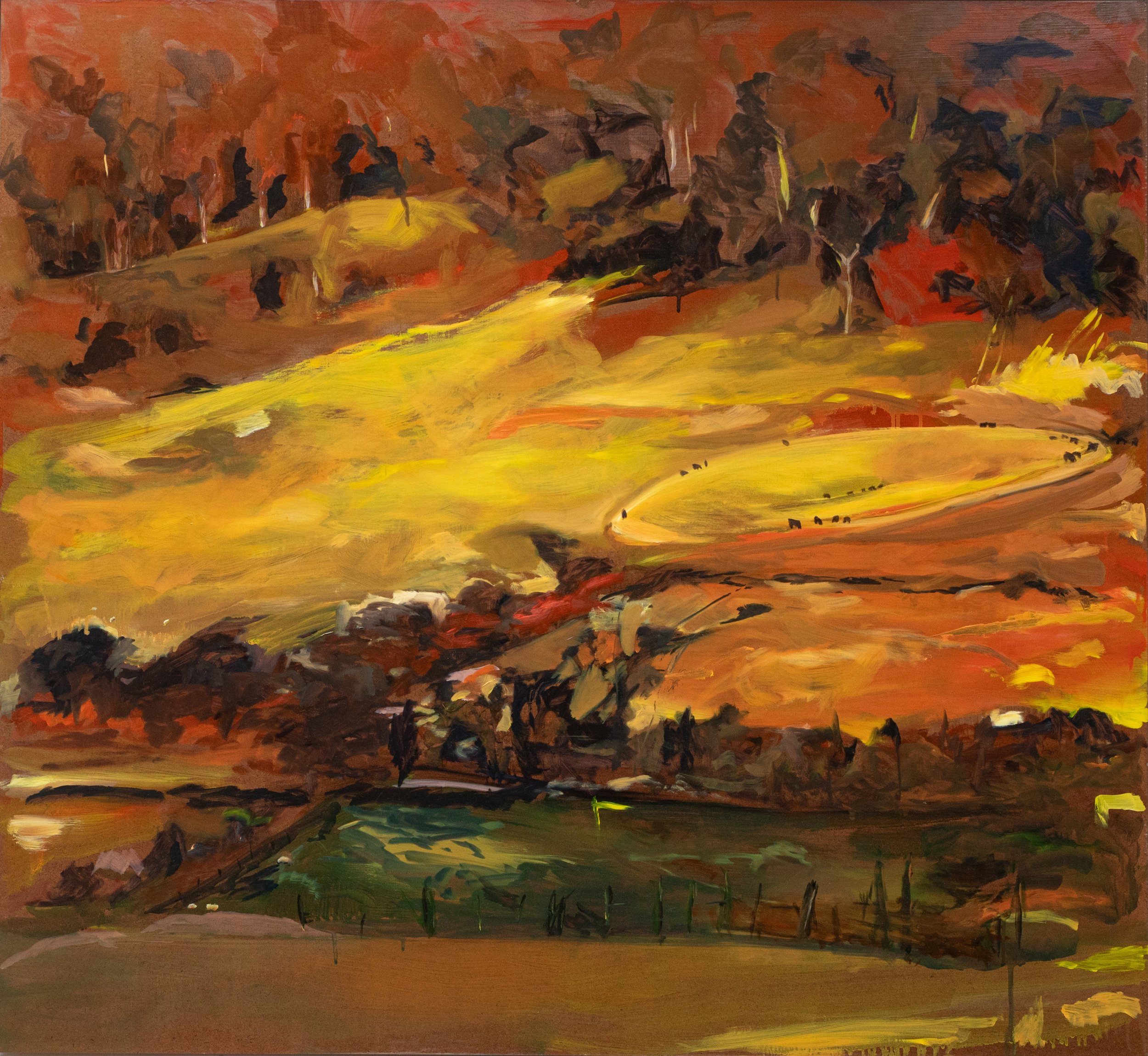
Slow Burn

1
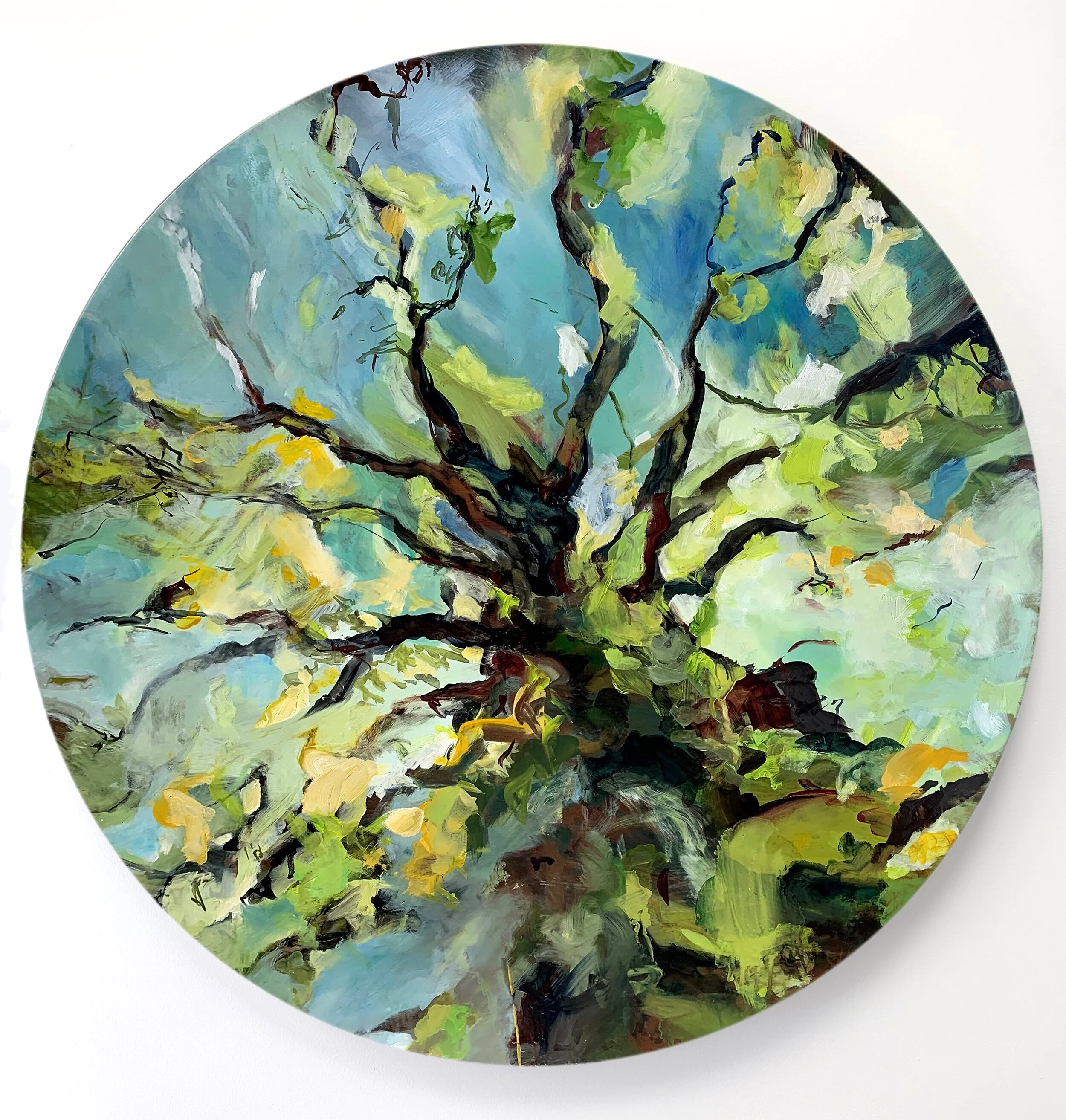
Encounter

0
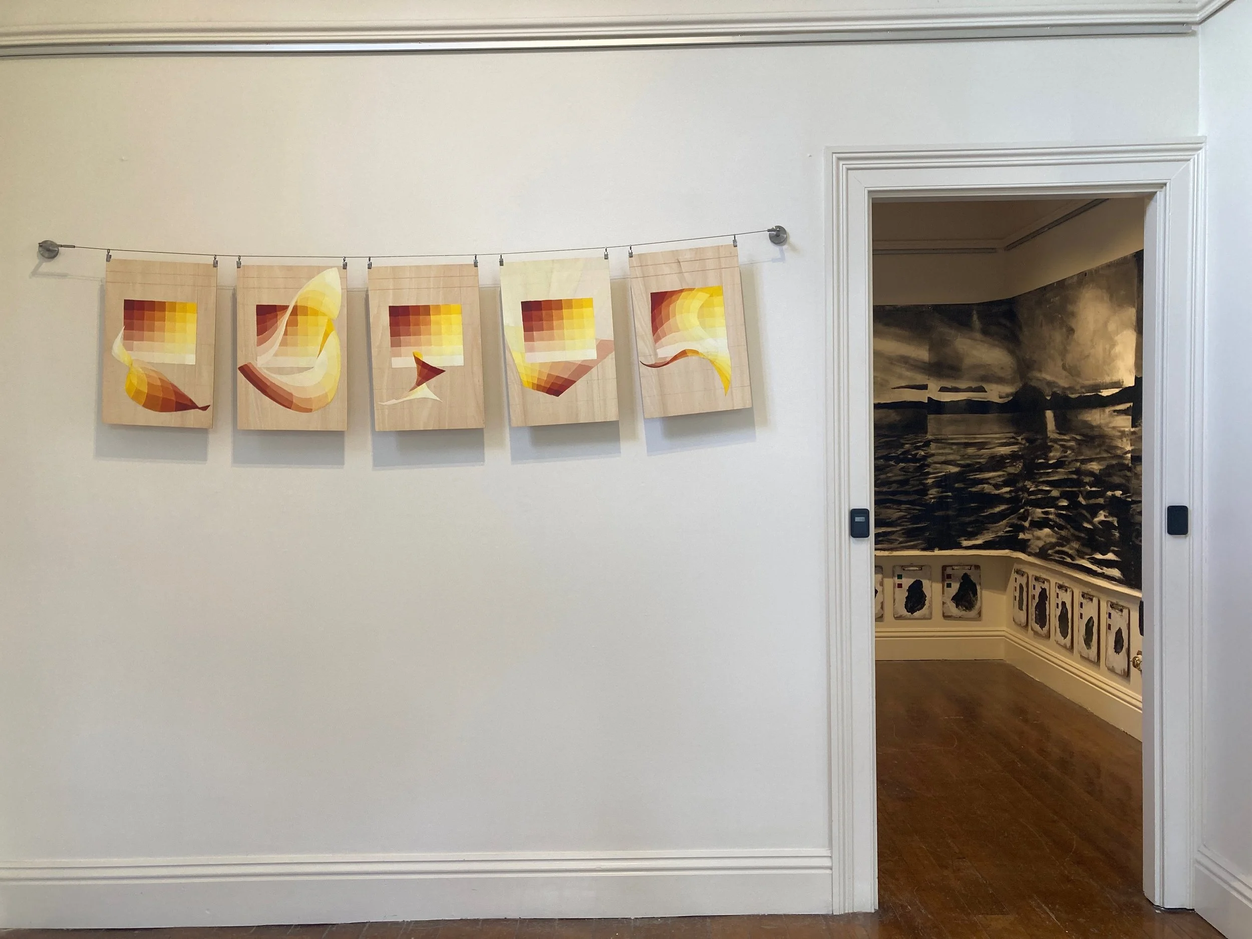
Brilliant green, Cadmium Yellow, Arylide Yellow & Green Gold
0
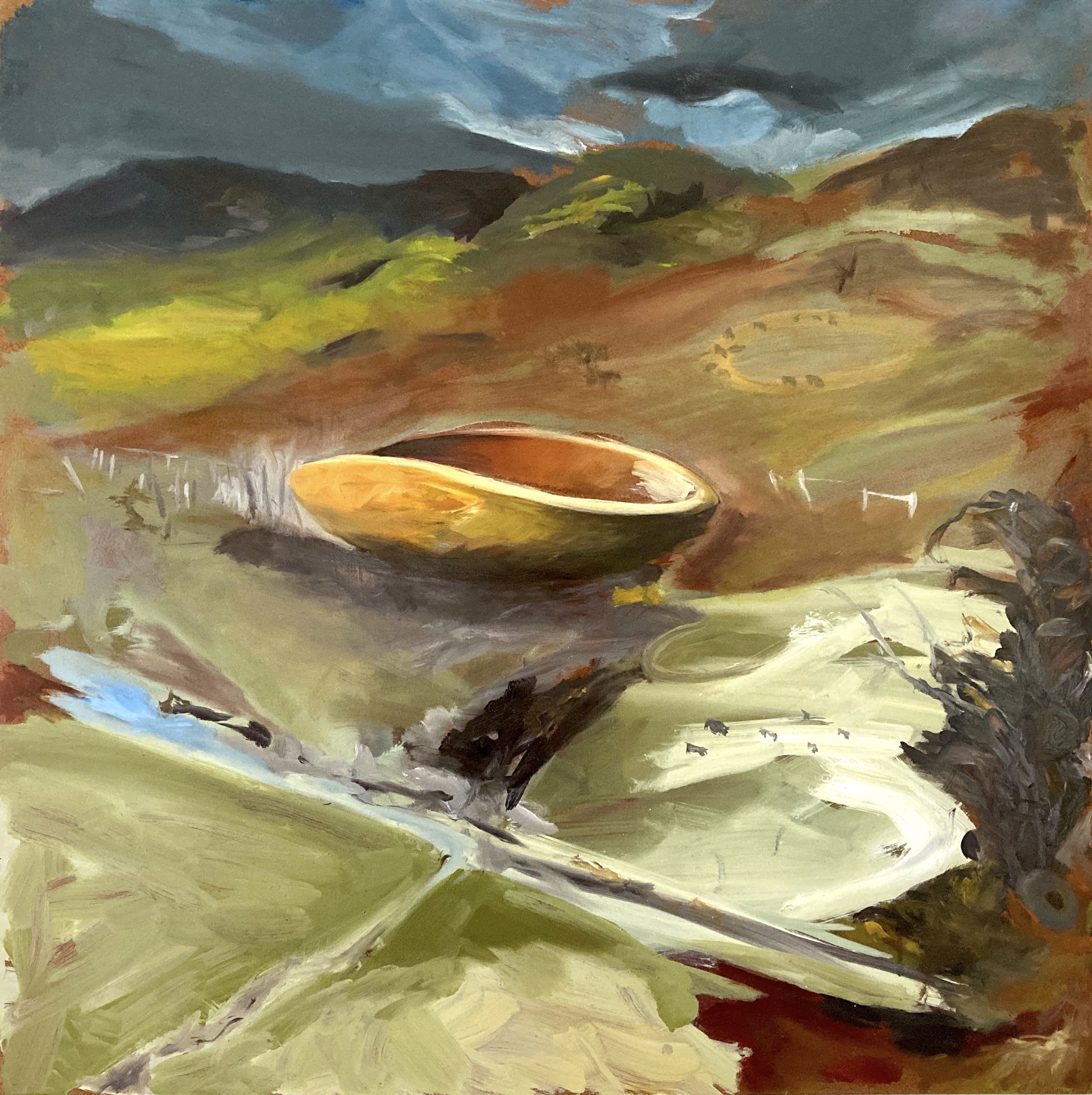
Silence from the Coolamon (Indanthrone Blue, Azo Orange & Arylide Yellow)
0
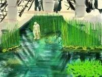
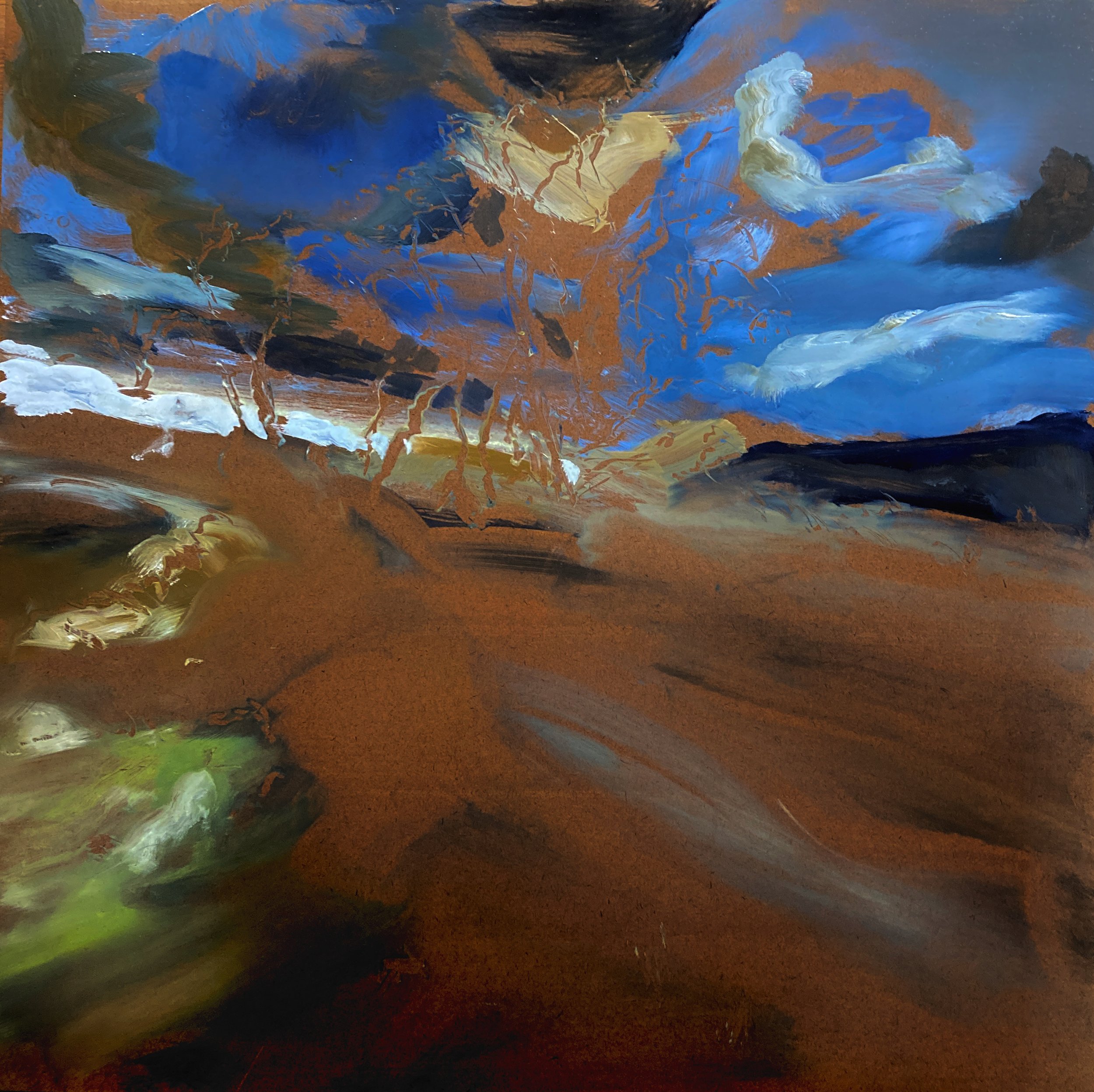
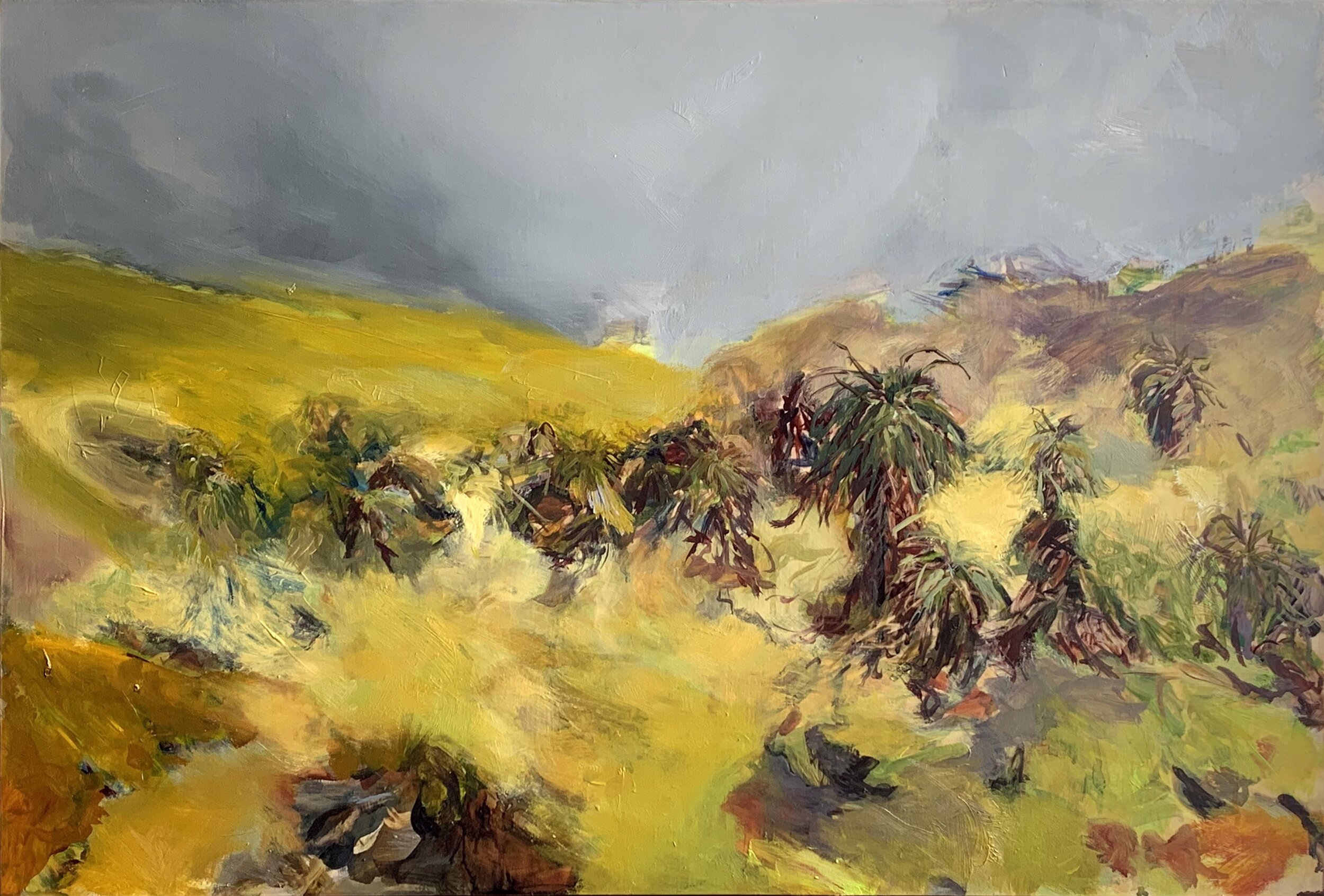
Sounds from the Coolamon (witakina/Glover country)
0
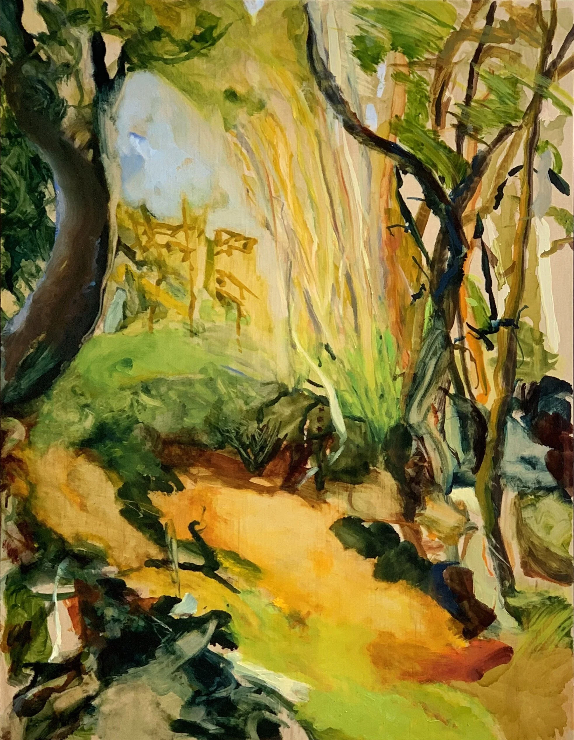
Thin Space; witakina country, 5:40 pm
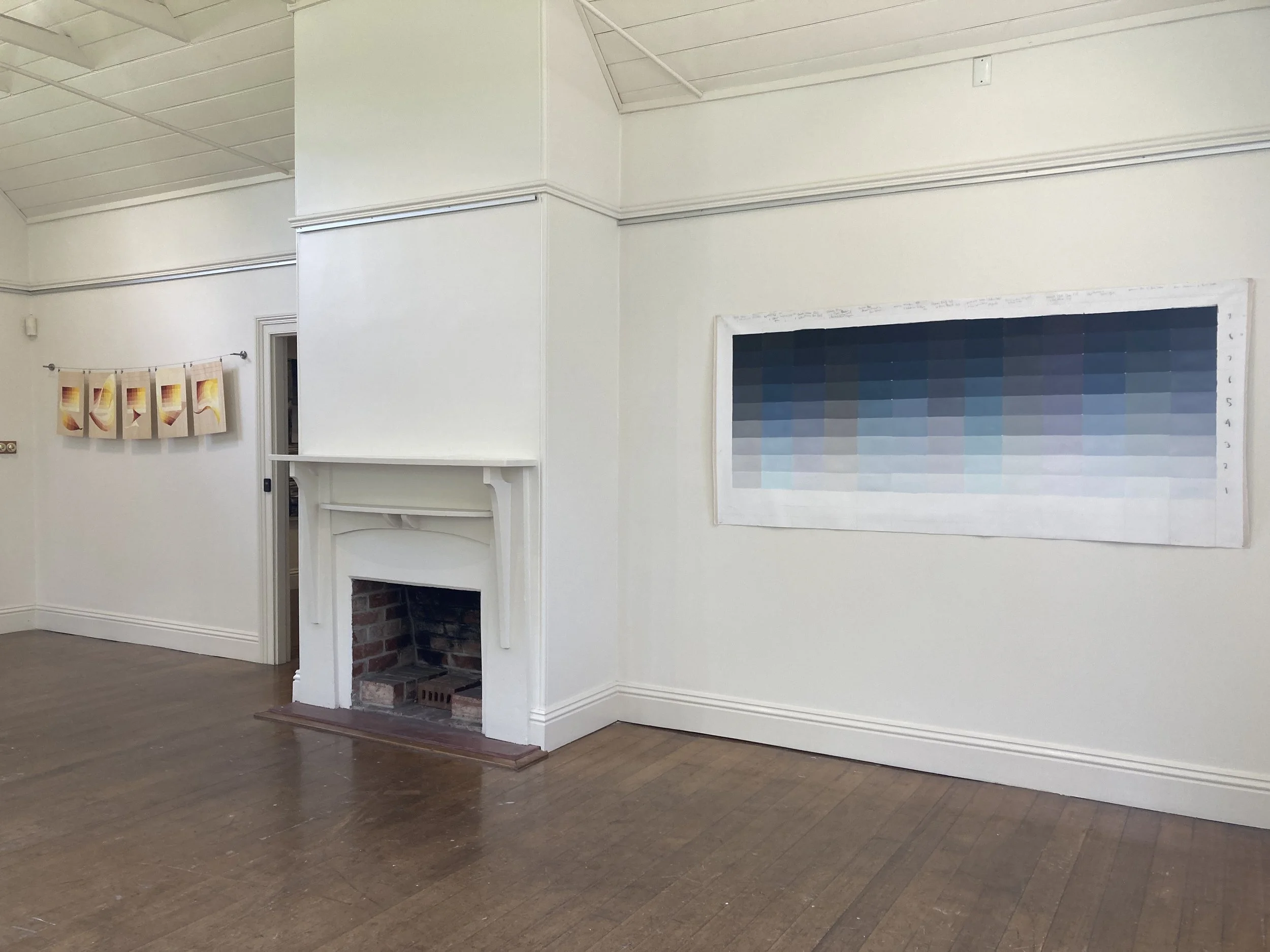
7
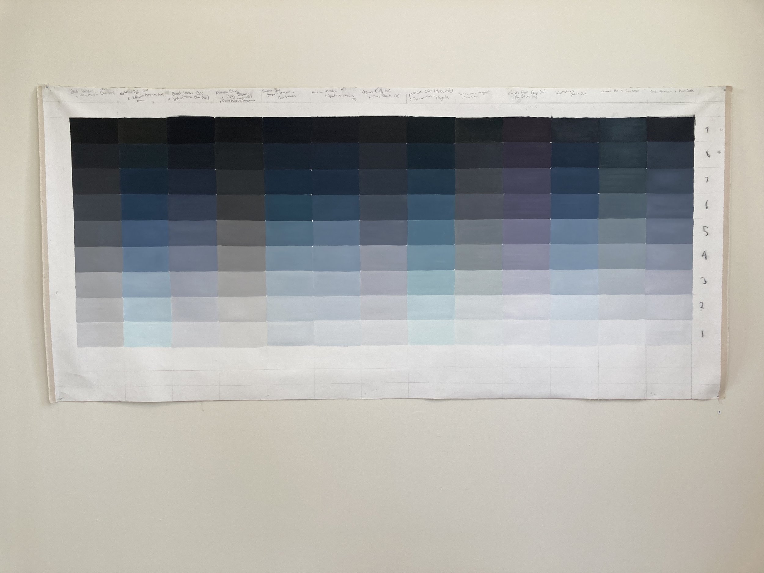
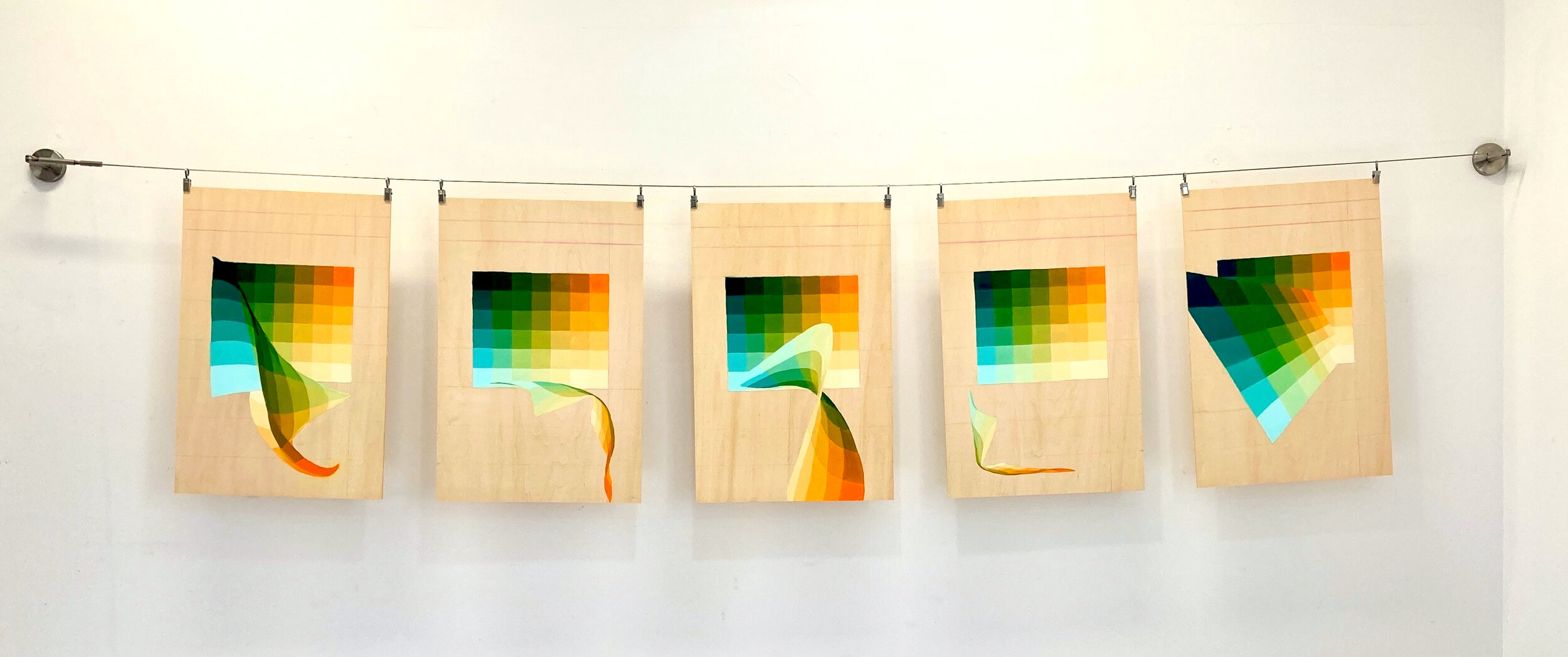
A Chart Stripped Bare - freedom in restraint

6
Gray Zone 1-13

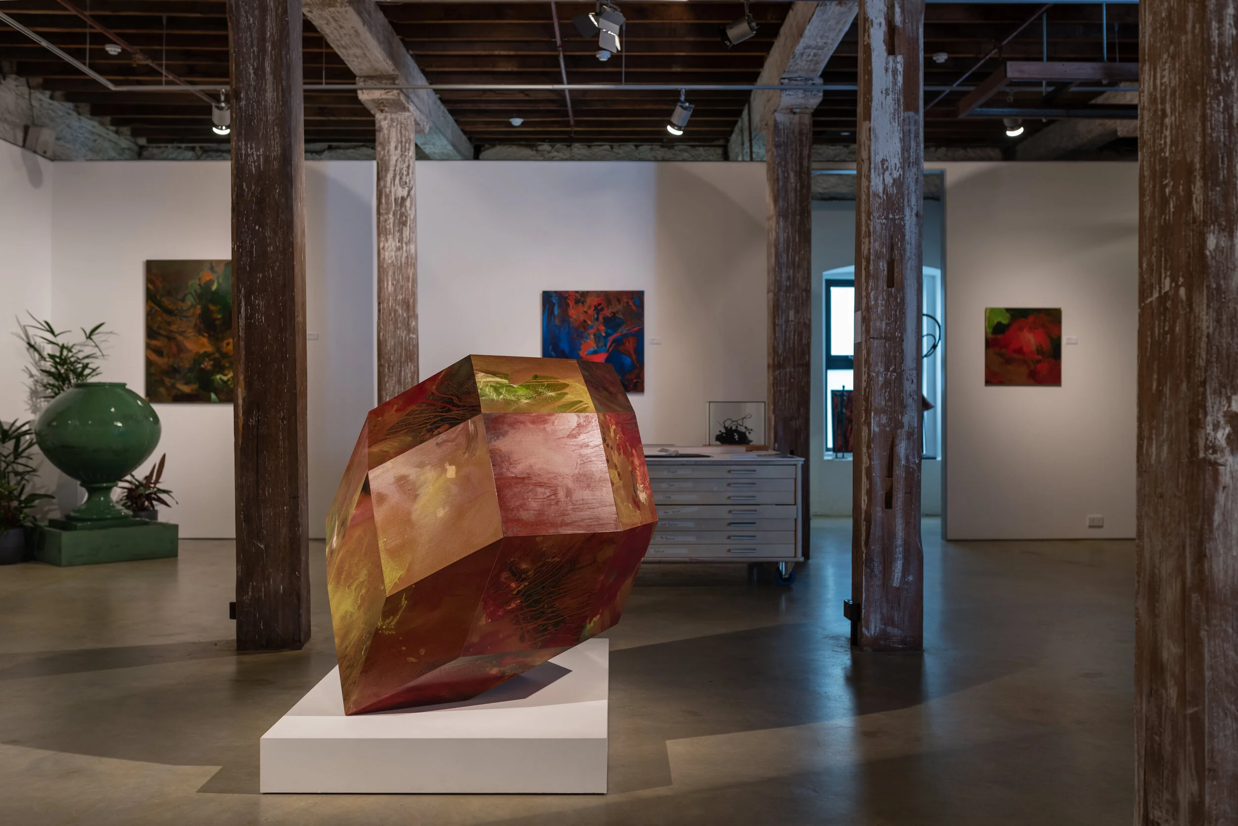
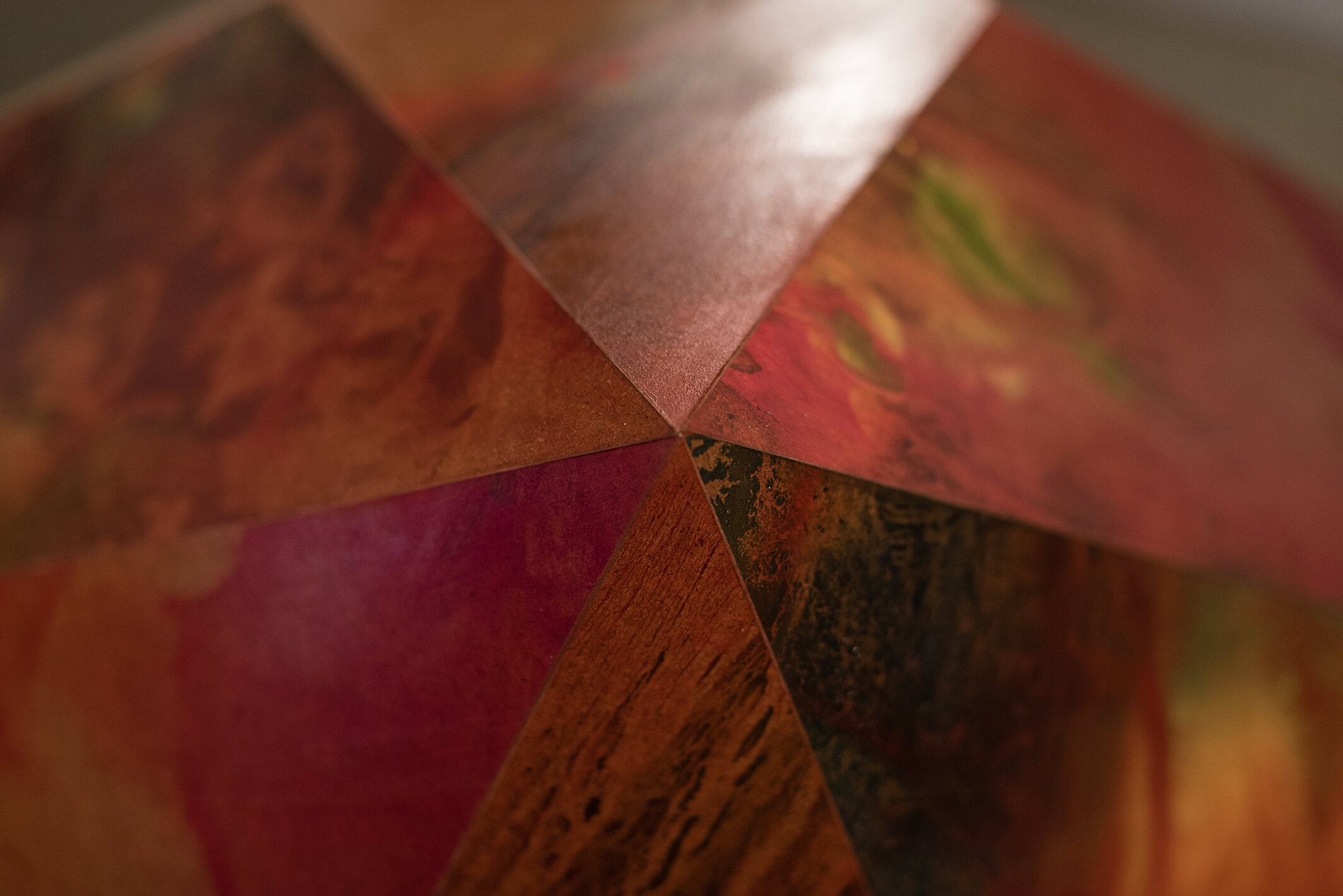
9
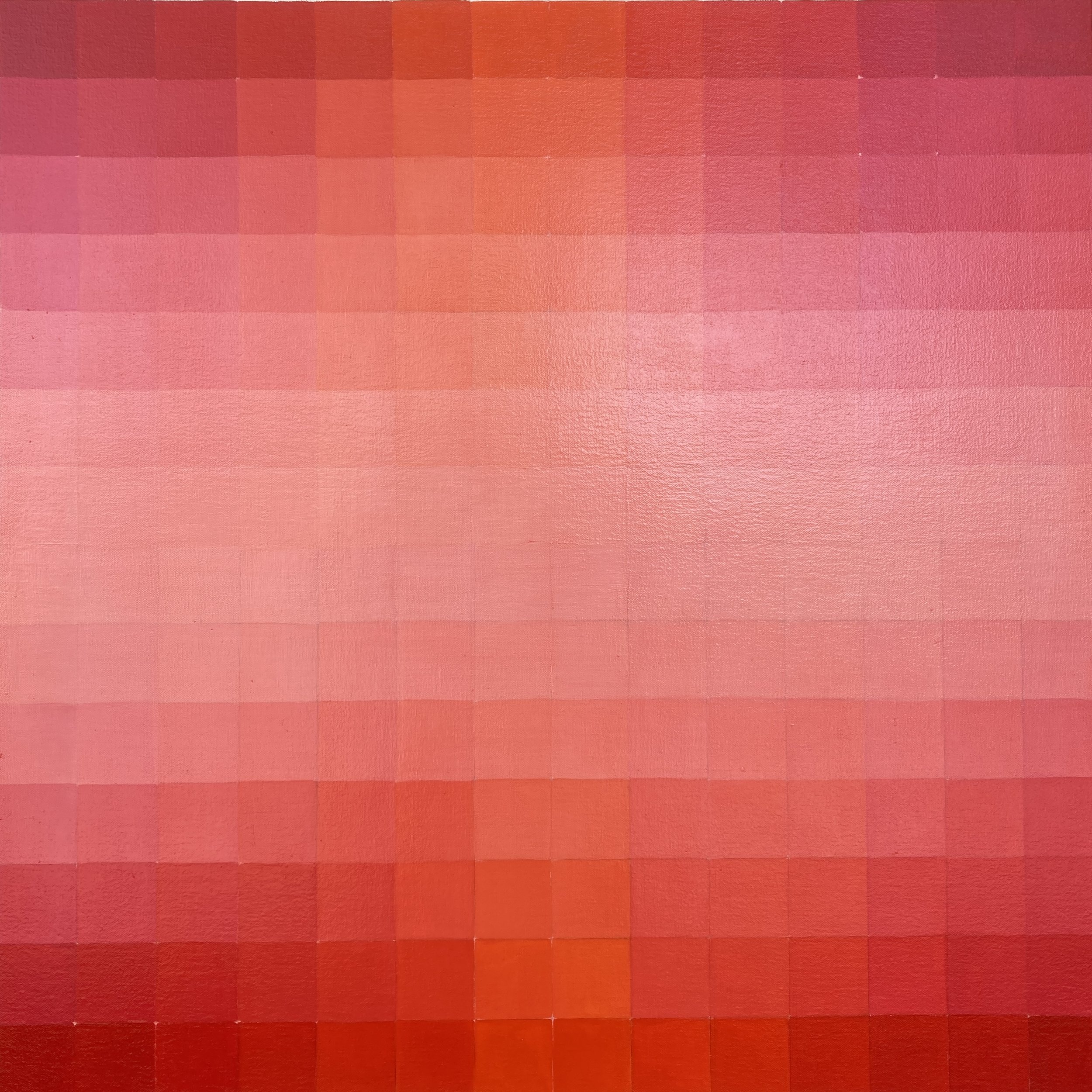
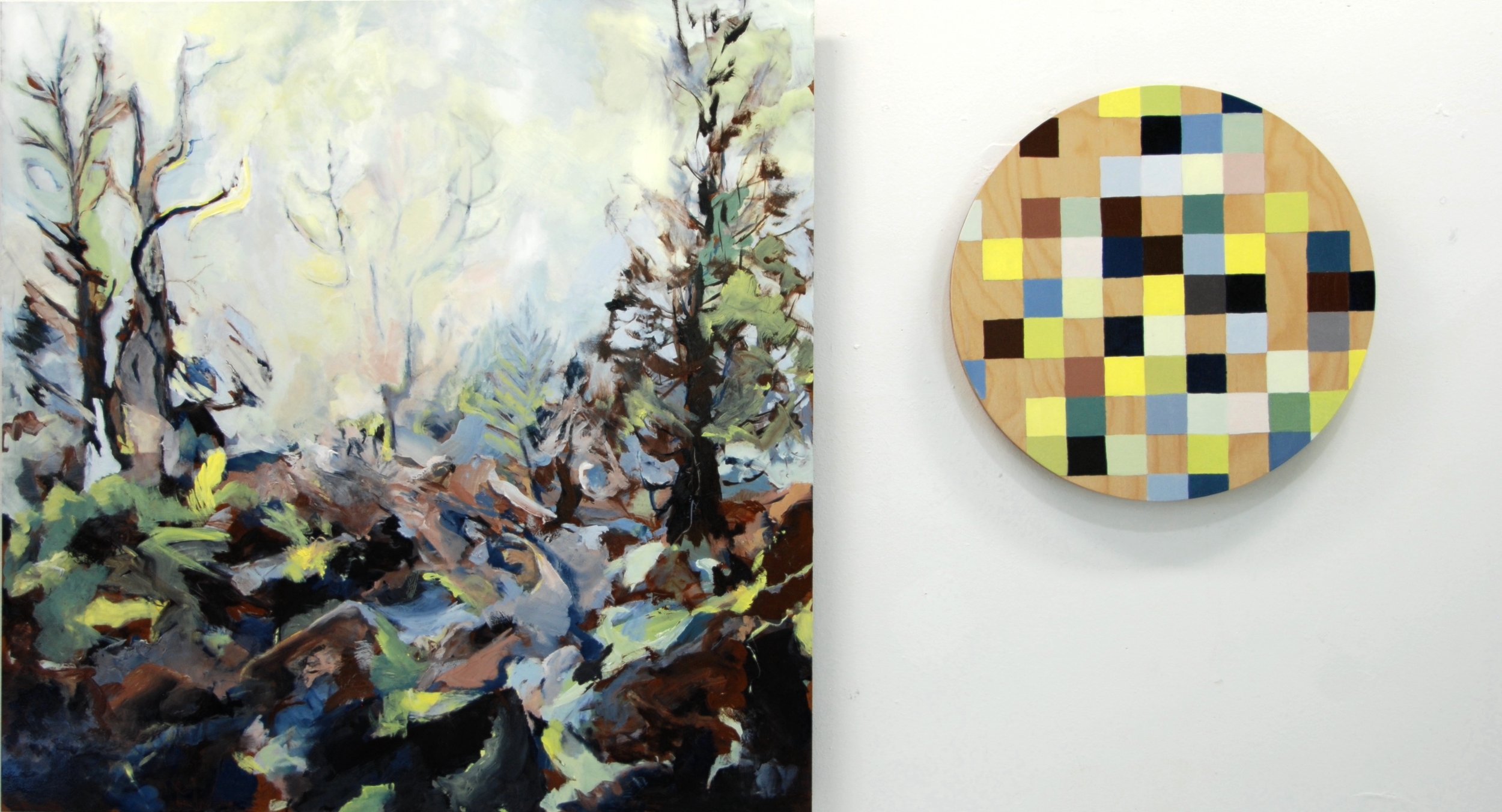
Freedom in Restraint – Quinacridone Burnt Orange and Chrome Yellow Hue, 2021
0
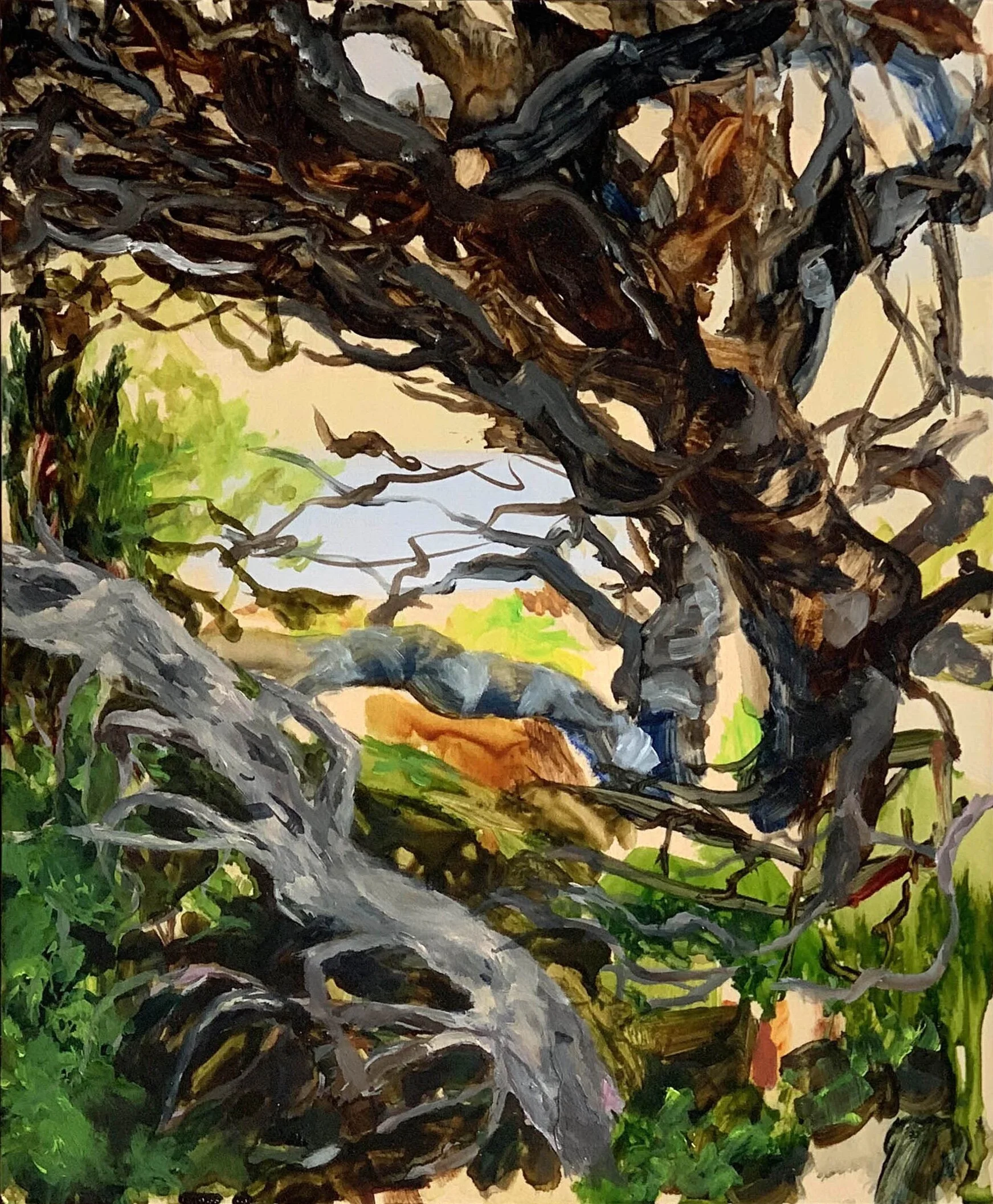
Pine Lake in brilliant yellow, paynes grey and mars brown

0
Musing from ‘A Non–Anxious Presence’[1], in the Gray Zone
3
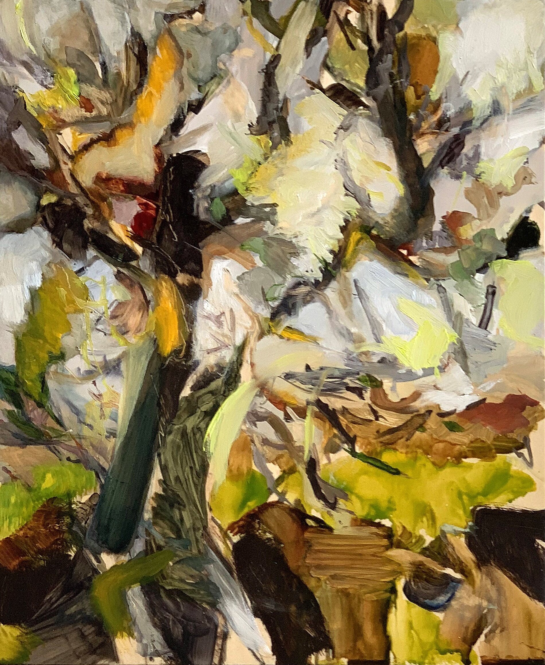
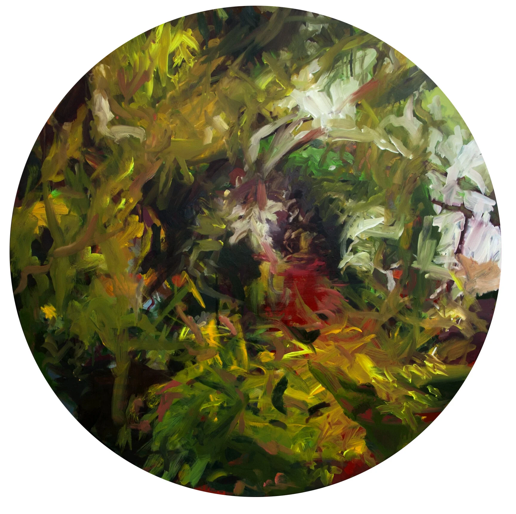
After the Wild
2
“Birch trees … loveliest of all when naked”
0
“Can these bones live...”
1
Rambunctious
25
Disruptive Epoch
3
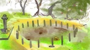
iPad Drawings